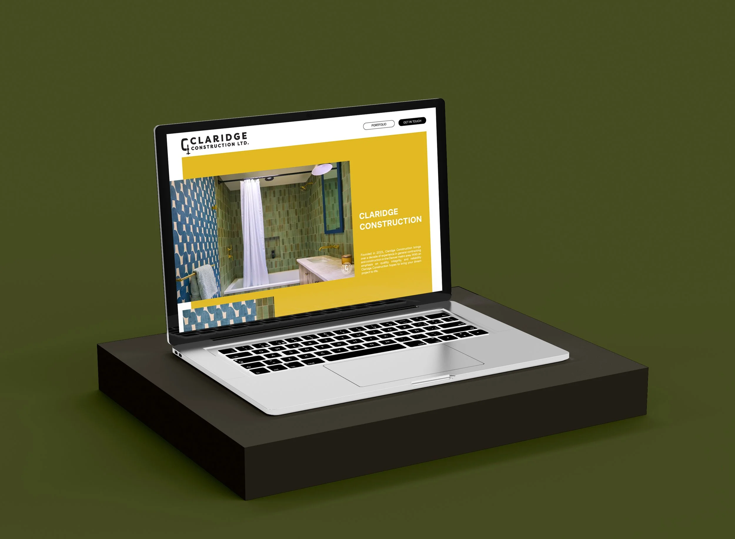
Branding Design
CLARIDGE CONSTRUCTION
Full brand and logo design for a local contractor and construction company that specializes in high-end renovations and remodels.
Inspired by the fact that the owner was originally a carpenter, the logo is comprised of a C clamp, both a play on the monogram, and a symbol of the craftsmanship and stability of their work.


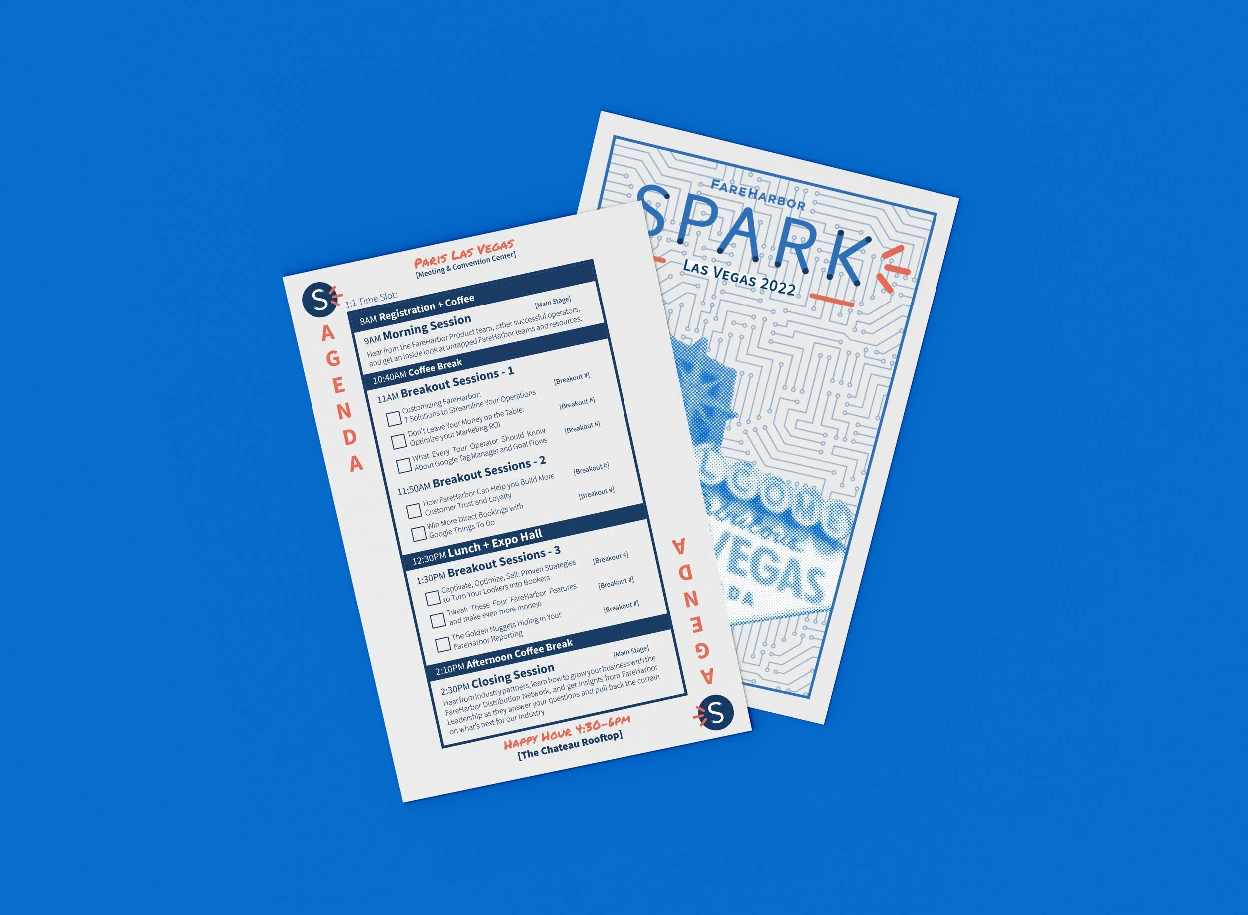
SPARK CONFERENCE
Spark is an industry conference put on by FareHarbor (part of Booking.com Holdings) for tour operators in the travel industry. The event took place in Las Vegas, and as a playful nod the location, the agenda took the shape of a playing card, while the t-shirts and other graphics utilized the already established Spark brand with location specific graphics. The goal was to create swag that felt like band merchandise, that operators would want to wear again and again.